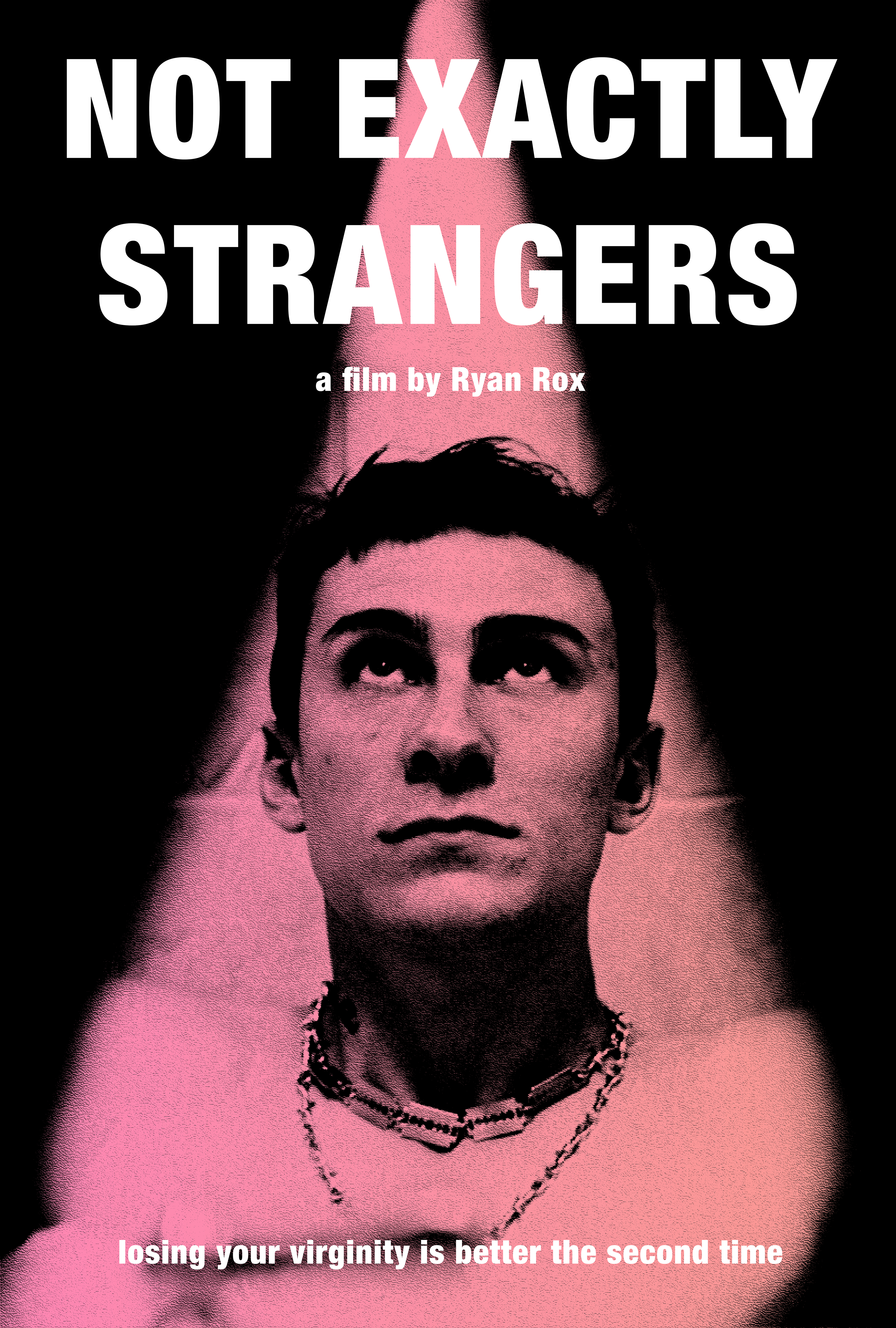
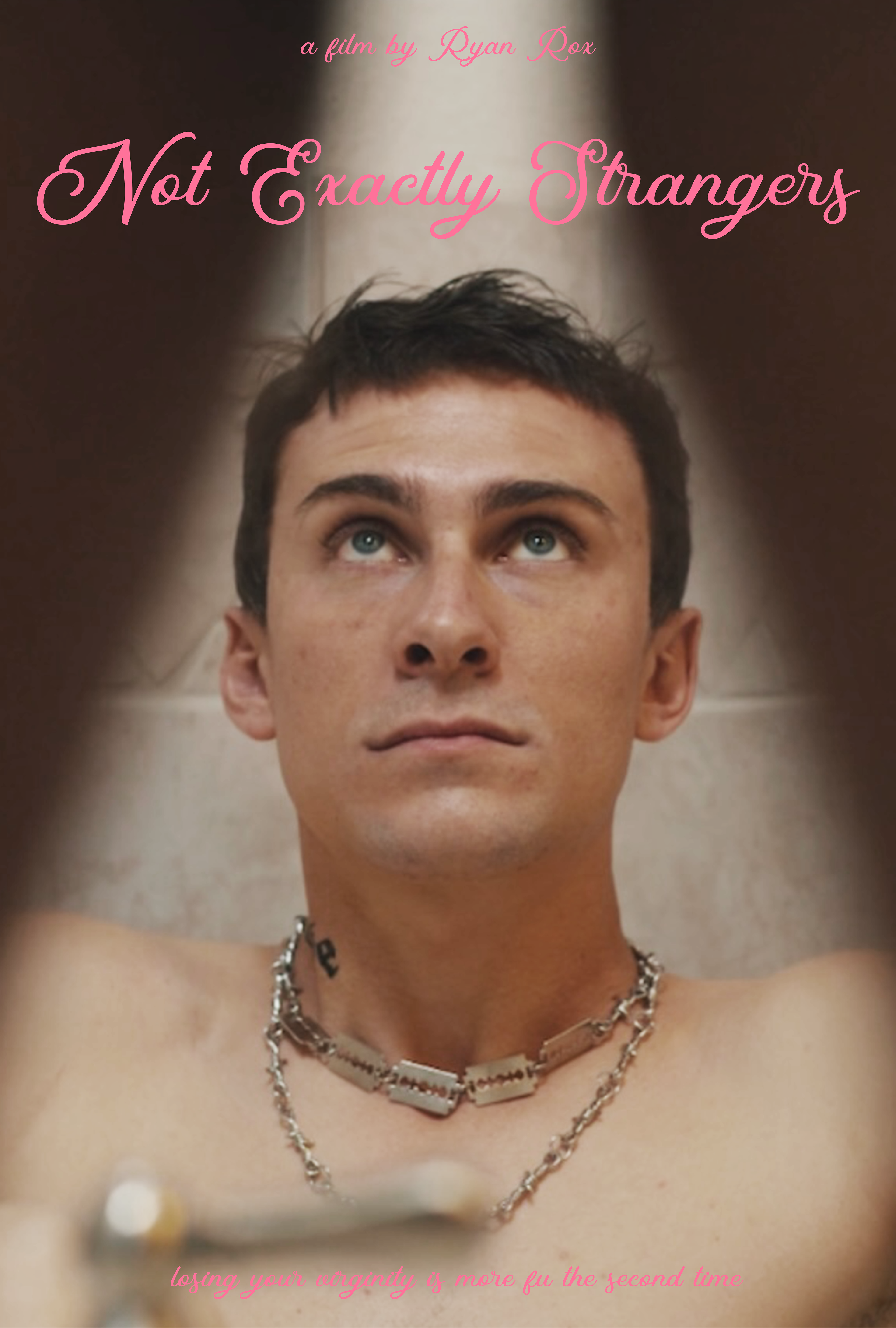
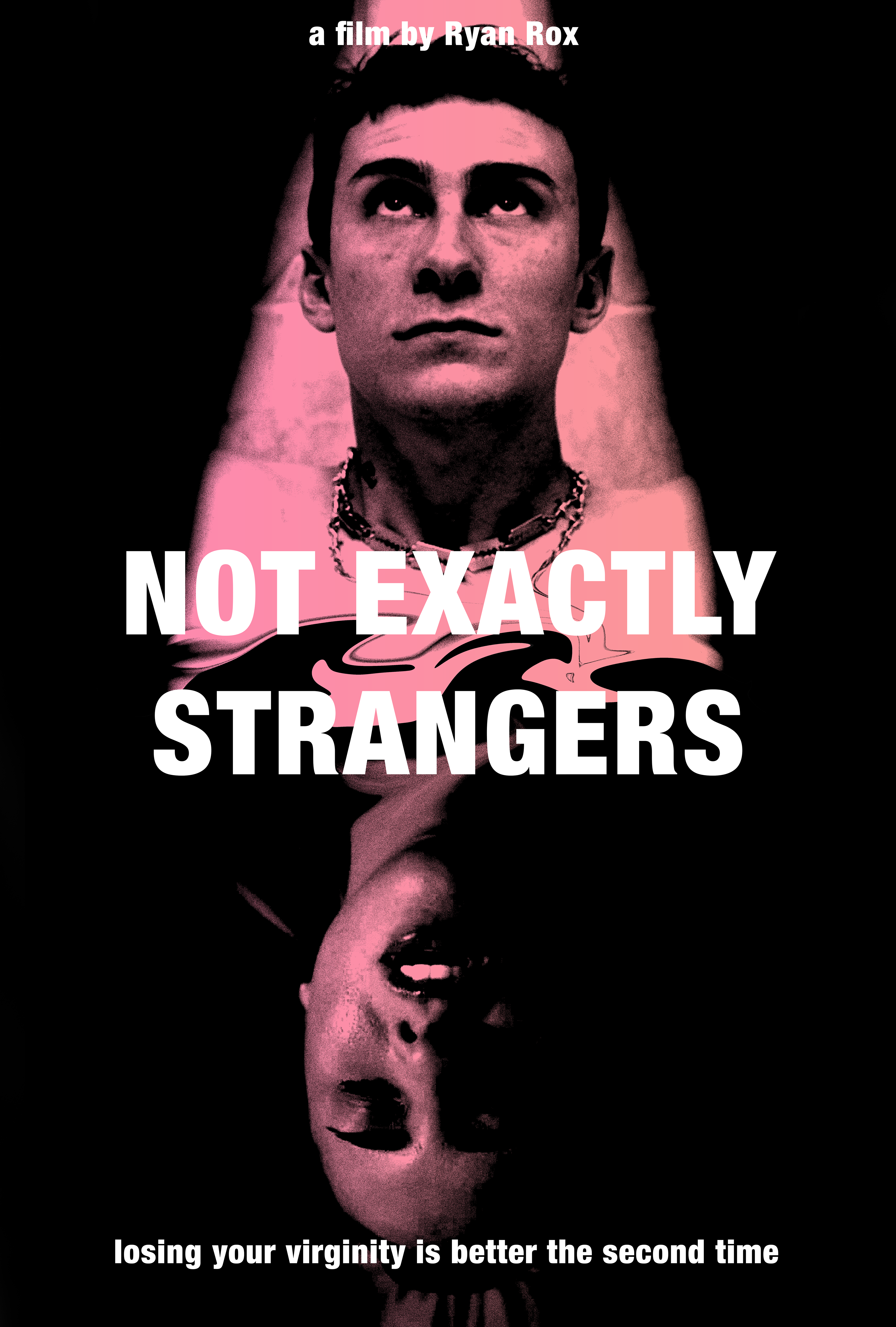
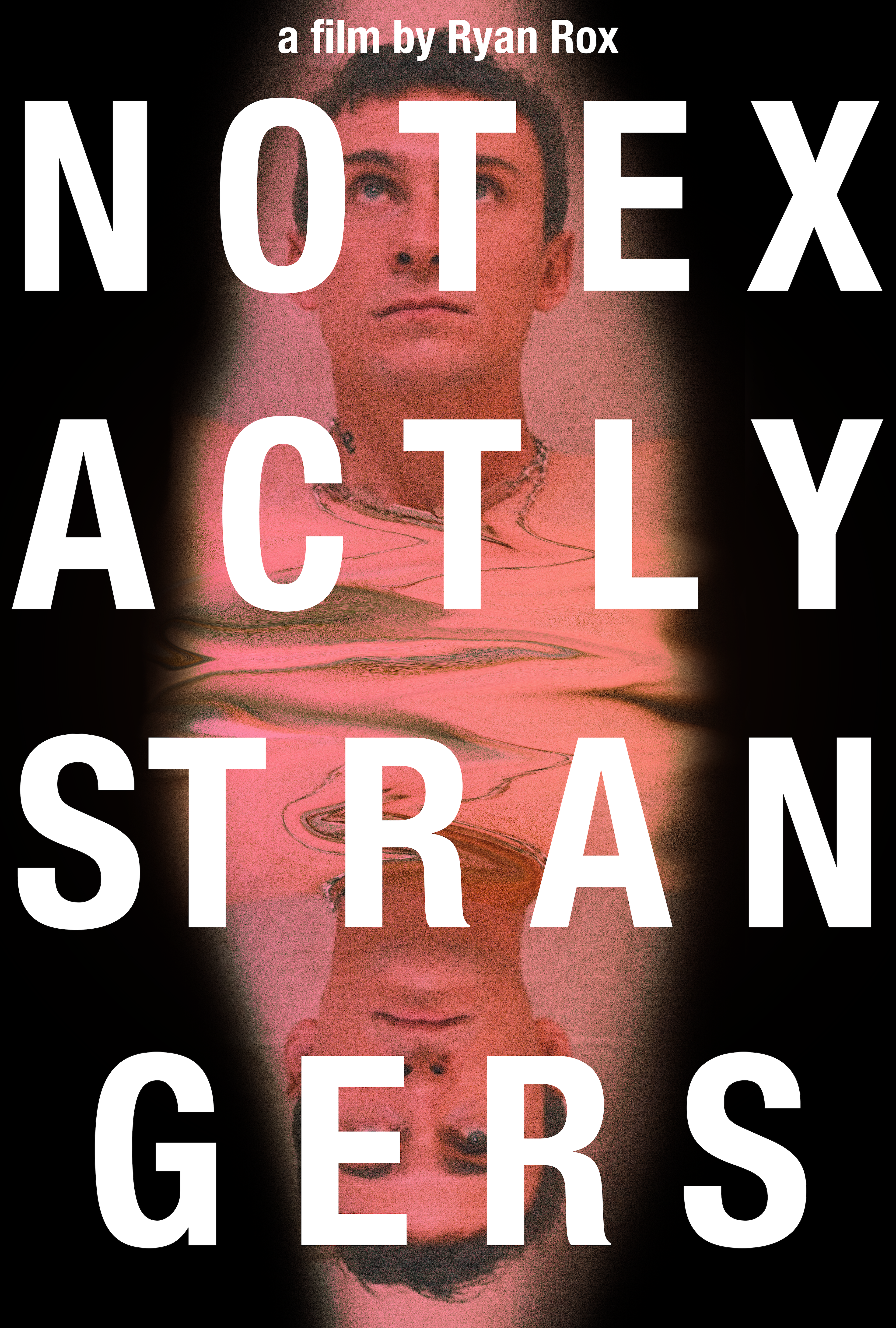
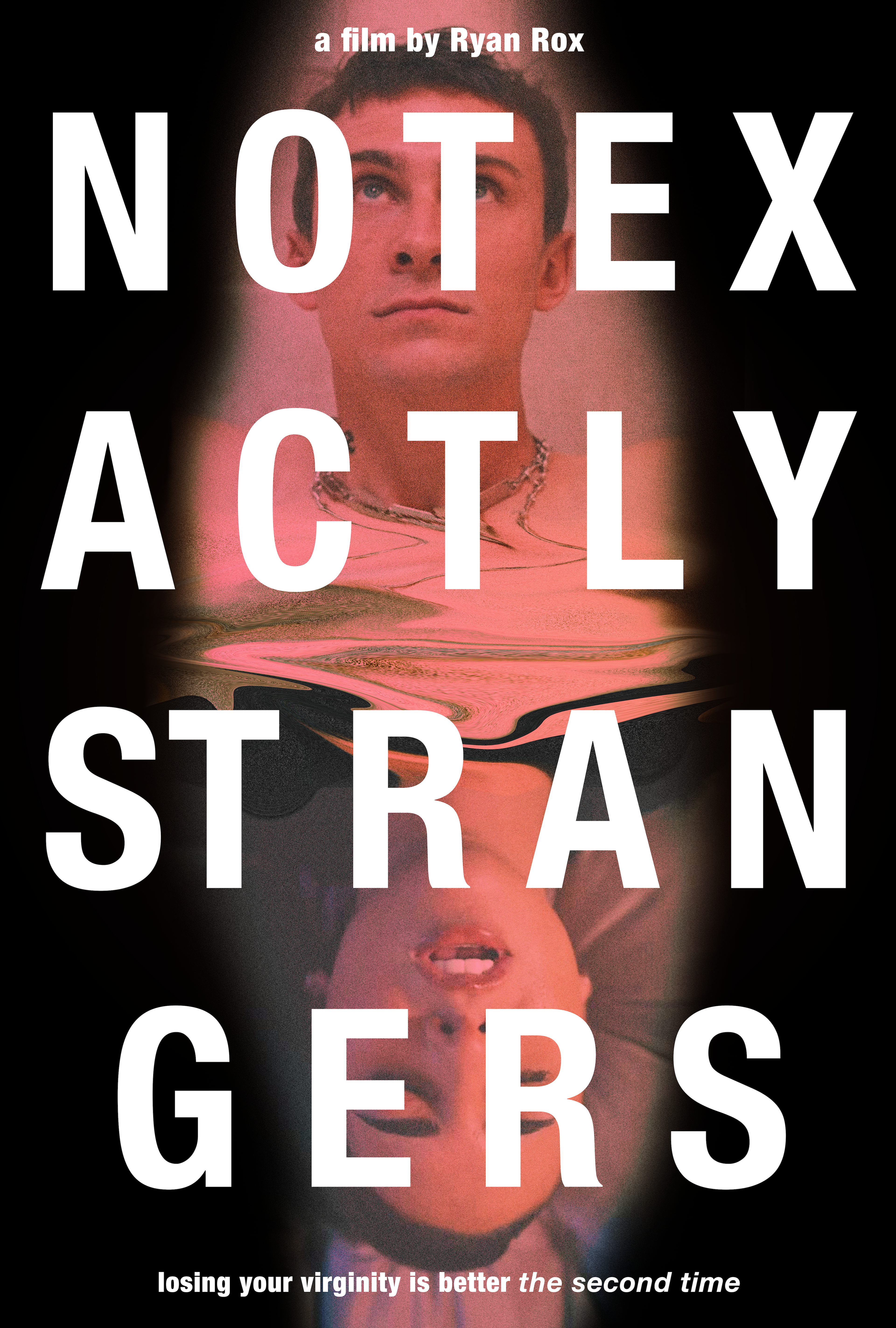
Not Exactly Strangers is an upcoming feature film directed by Ryan Rox, and I had the great pleasure of designing the poster for it. On the left is the initial concepts, and through several days of revisions and communicating with Ryan, we reached our final design on the right, combining some of our favorite elements of the concepts.
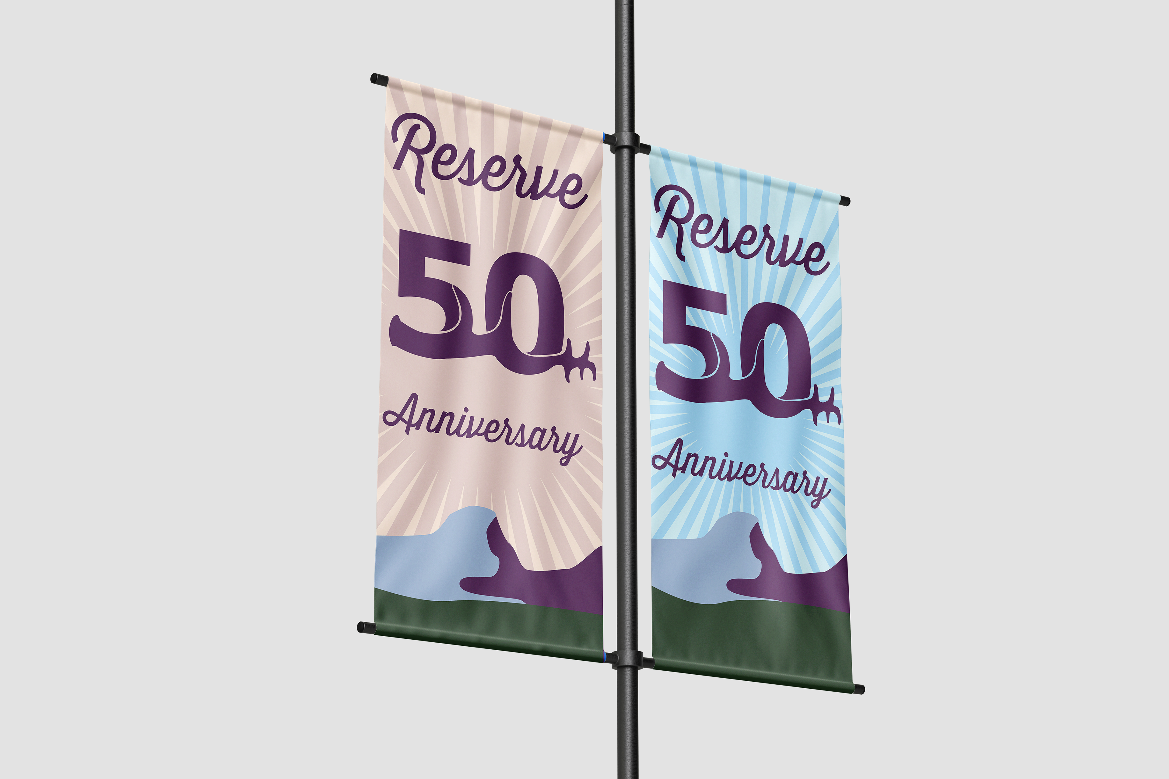
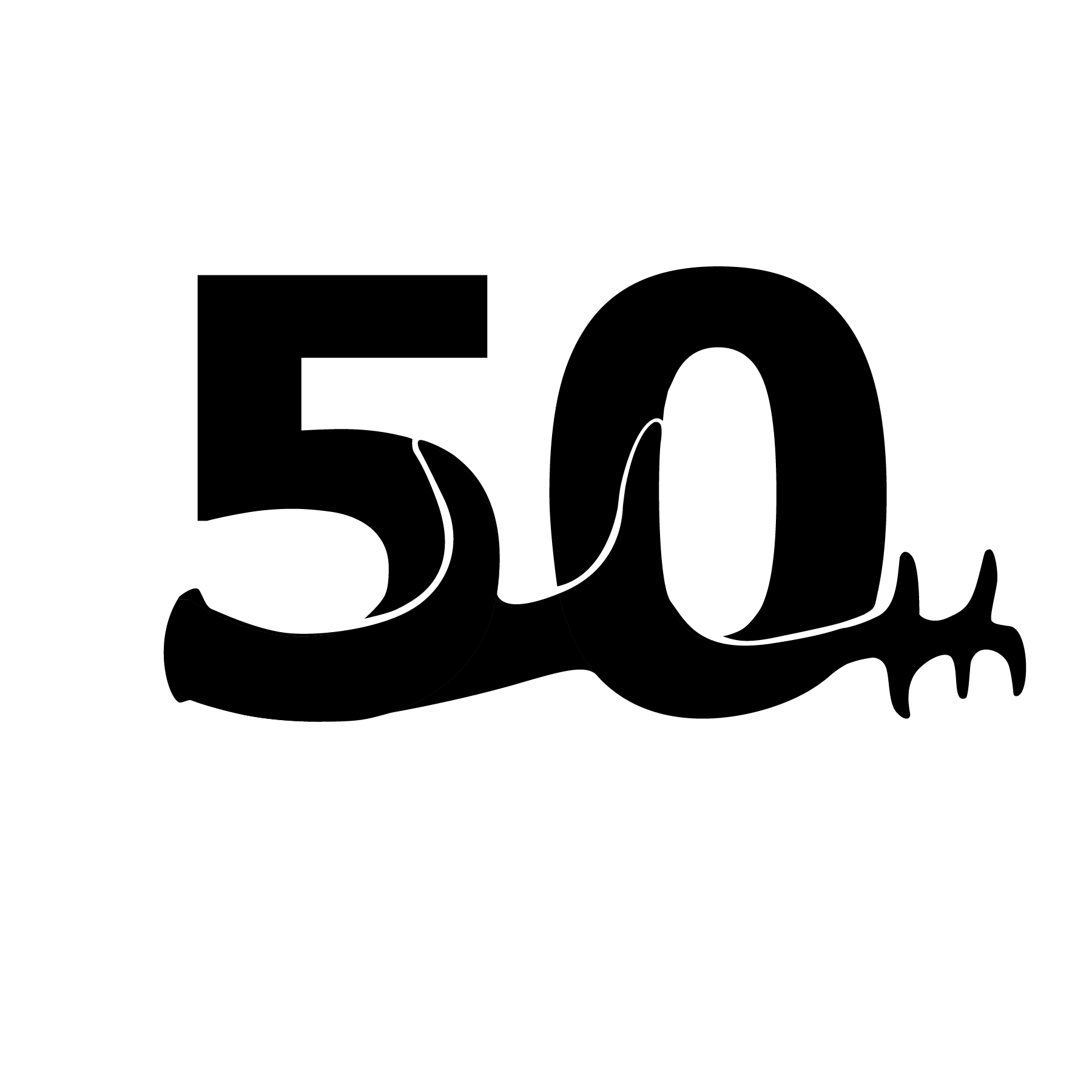
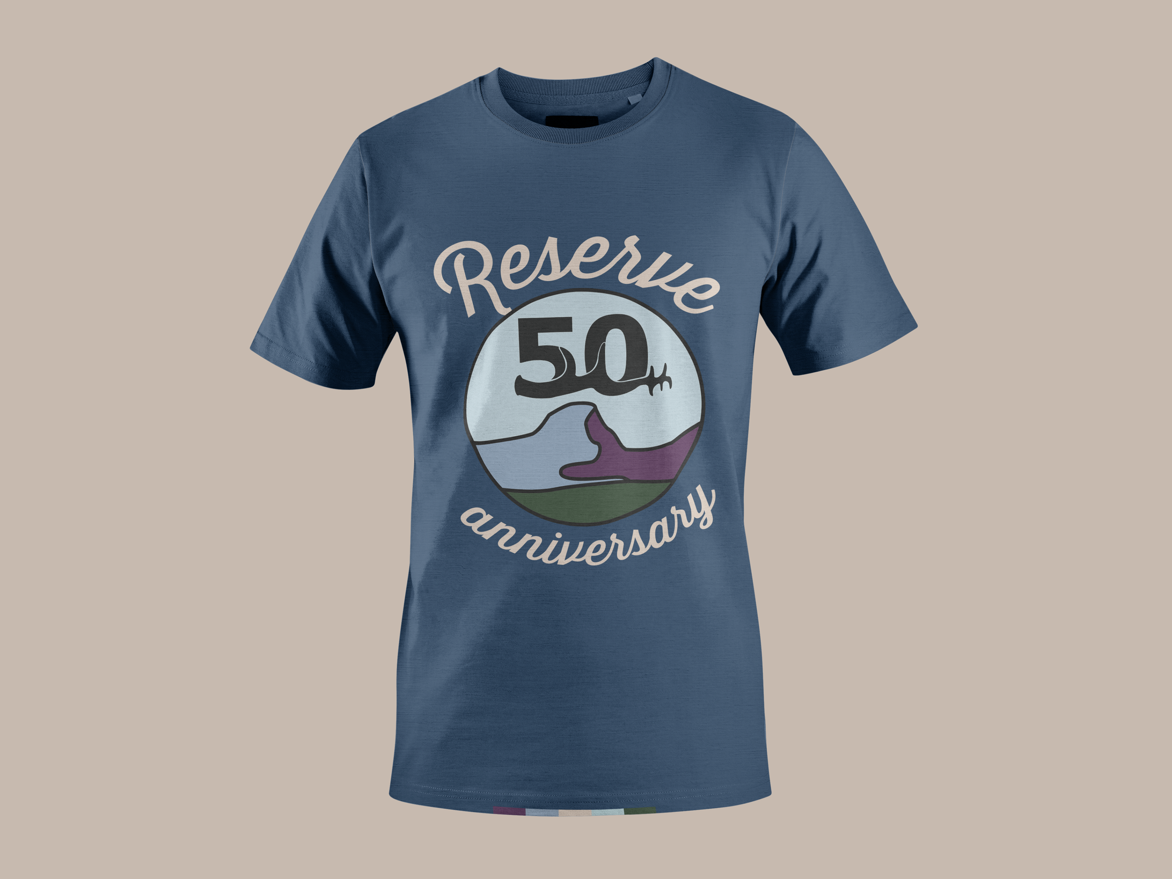
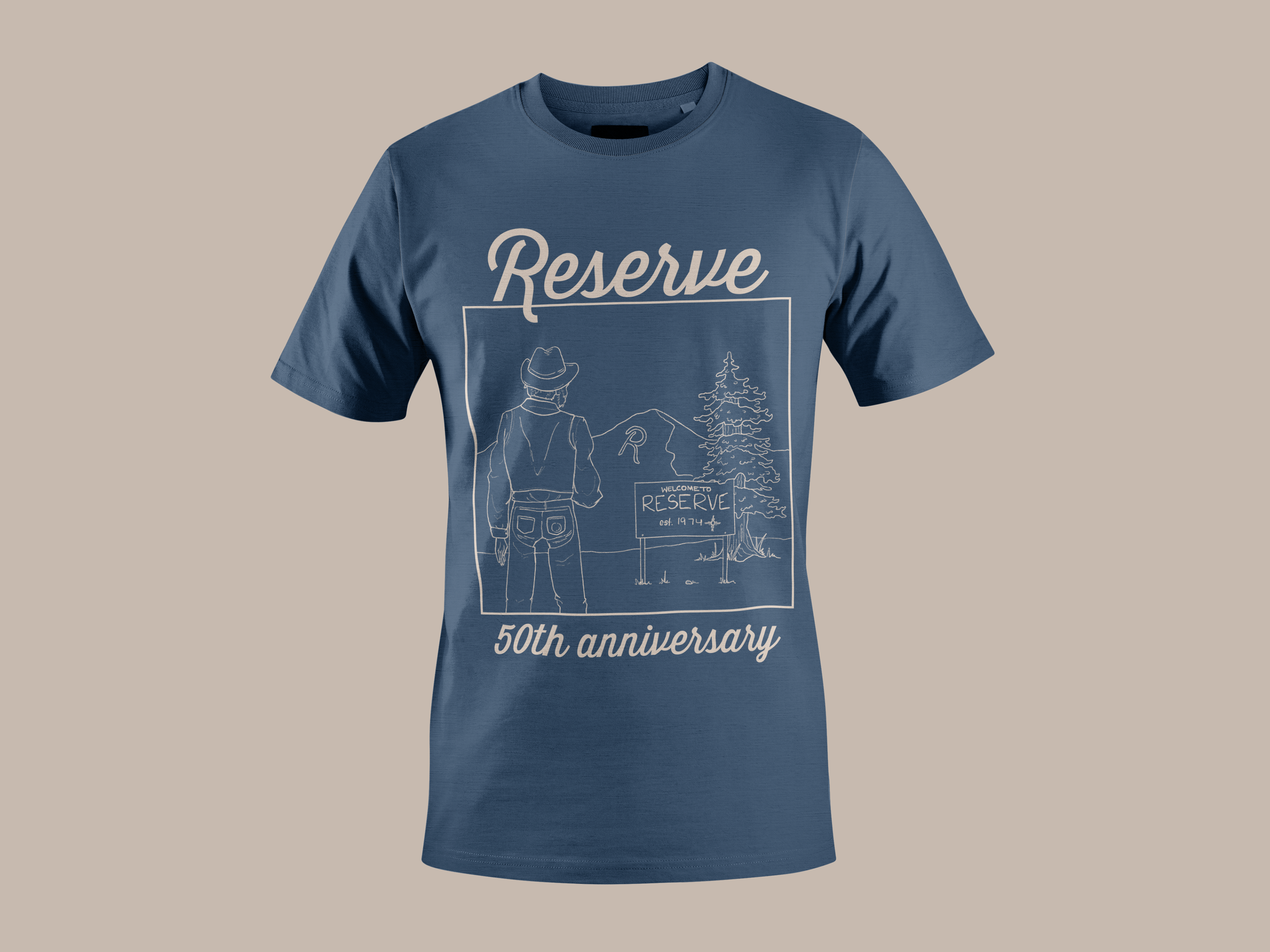
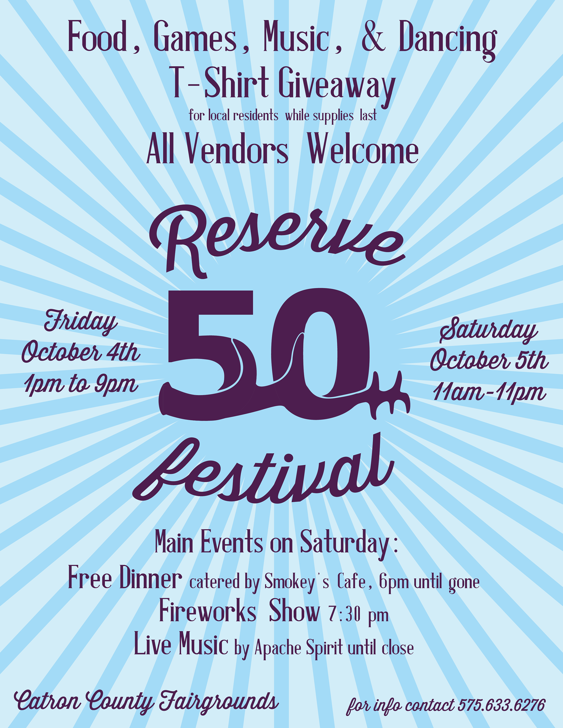
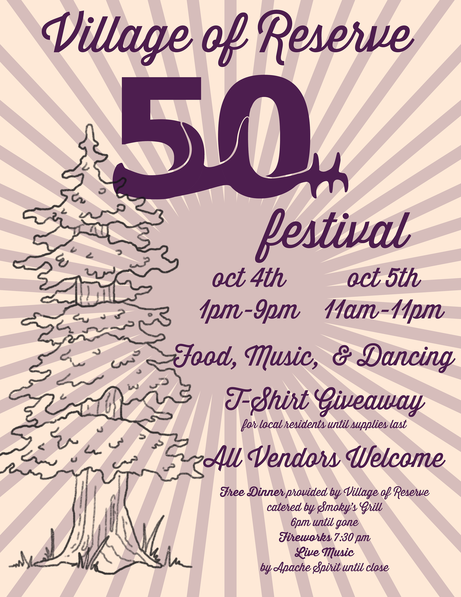
The festival design project for Reserve, NM's 50th anniversary. This is an ongoing project for the year of 2024, of which I am the sole designer. On the left, banner designs used for the outdoor town decoration, and on the right is the logo for the festival's celebrations and events. There are two t-shirt designs, as well as a poster design for the festival.
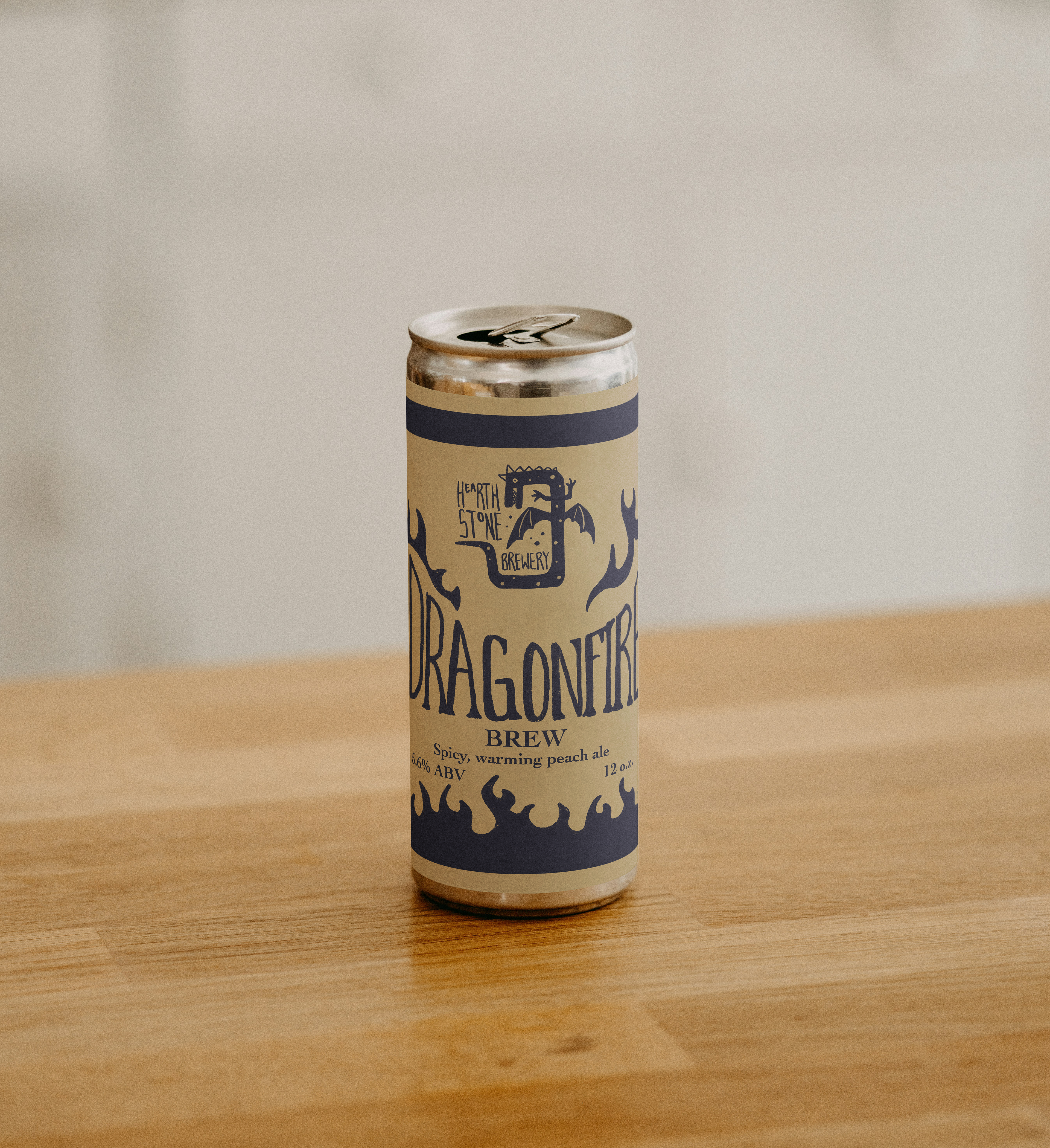
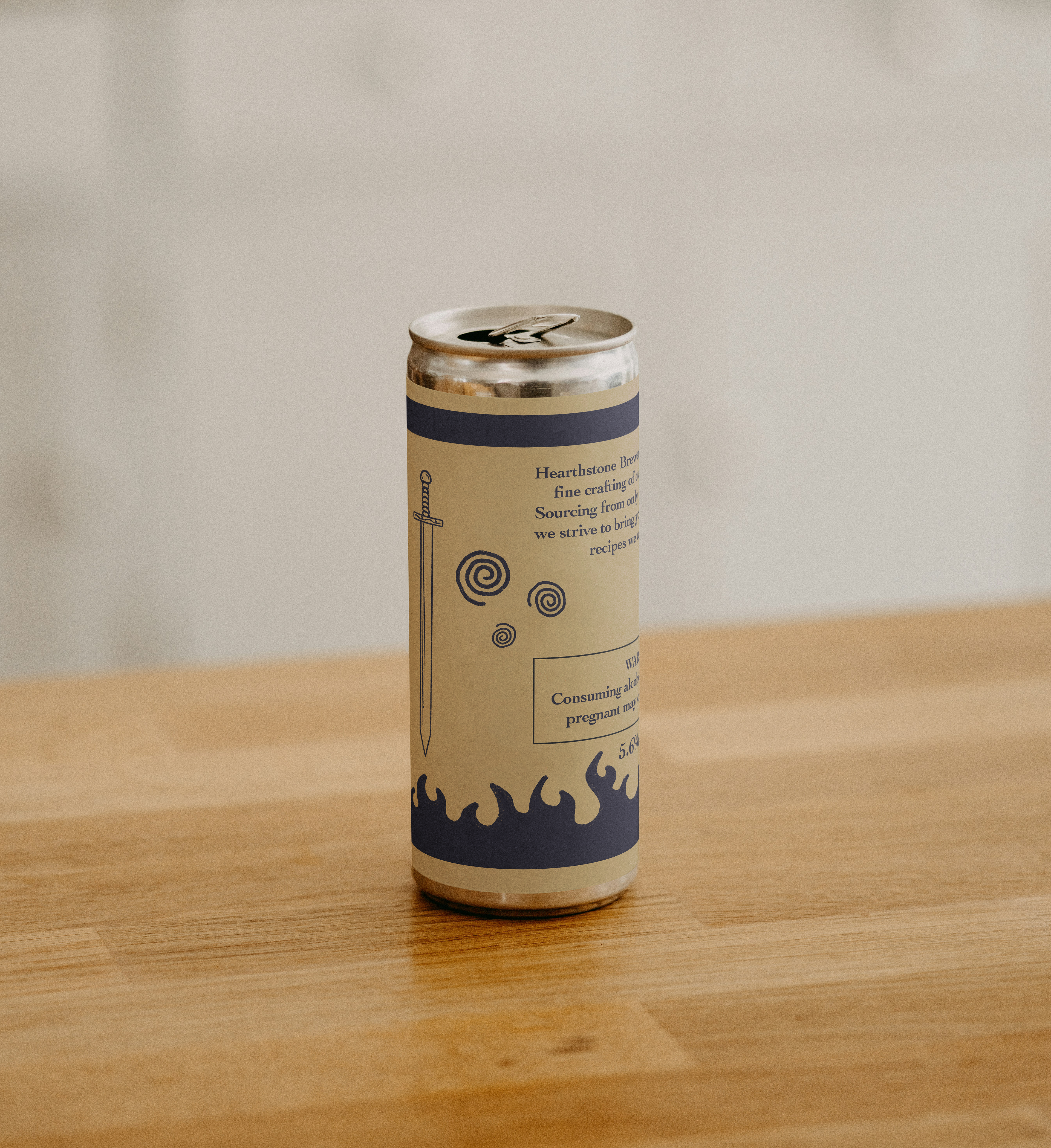
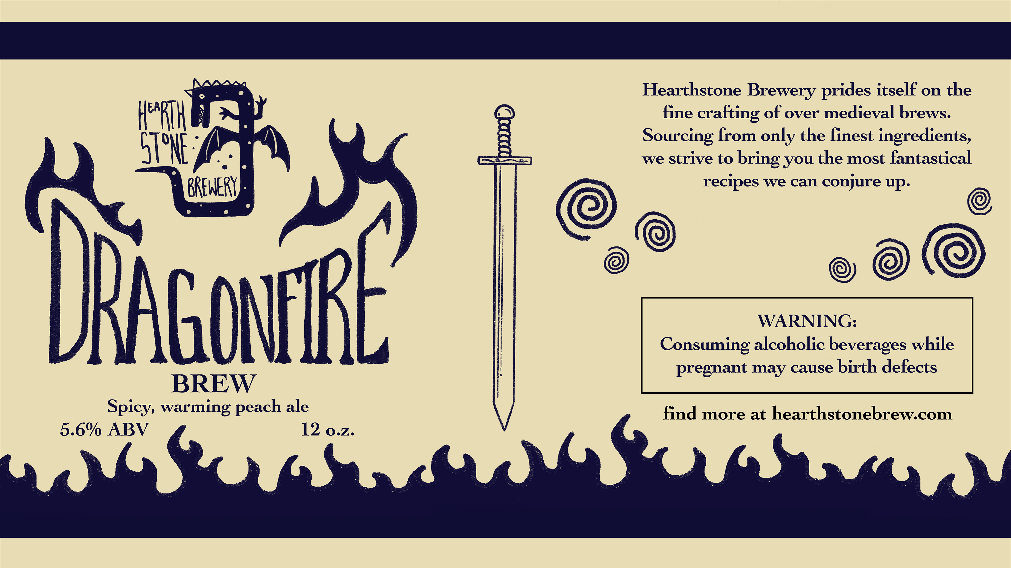
A fictitious prompt, this is the mockup for a fantasy inspired brewery and its accompanying can design.
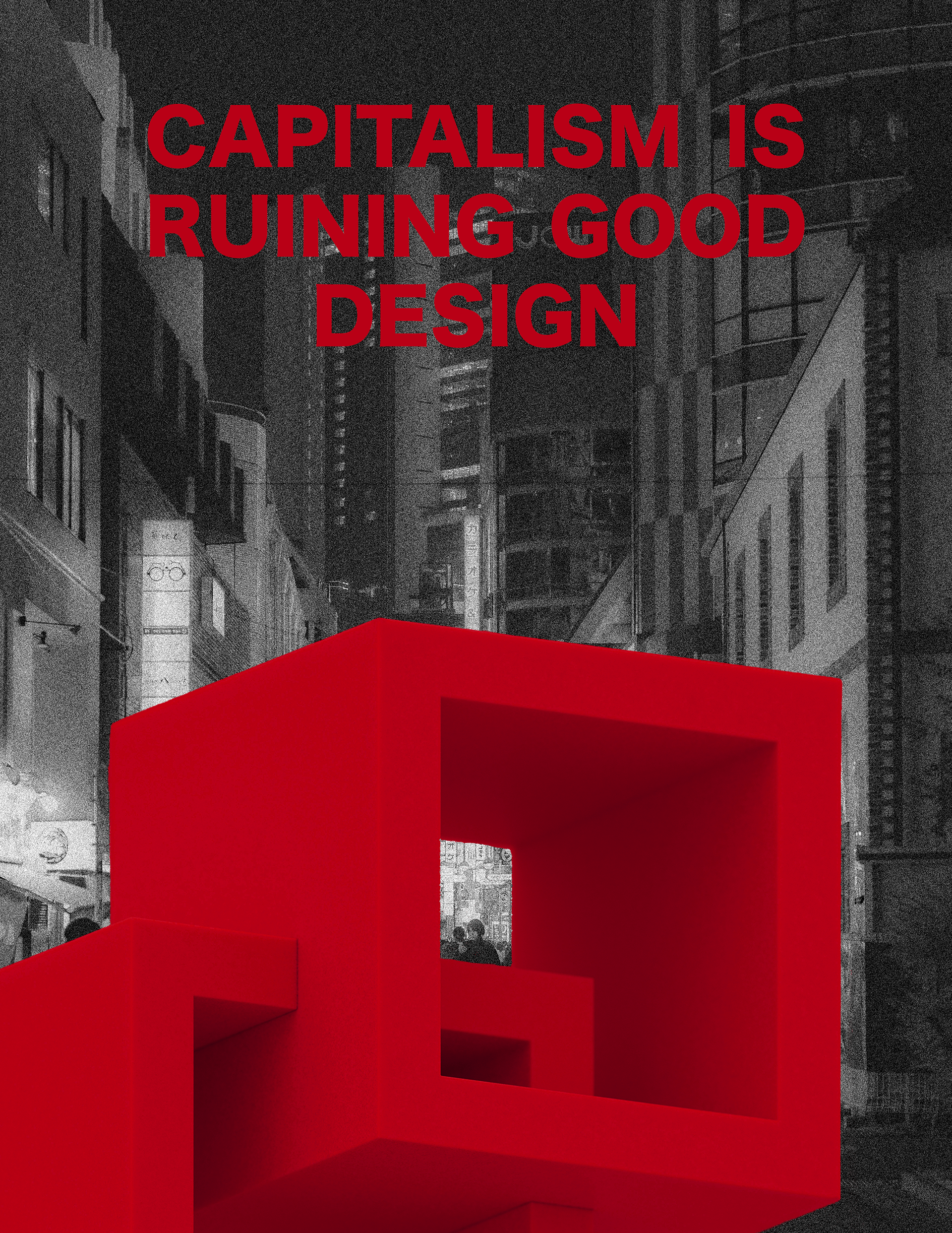
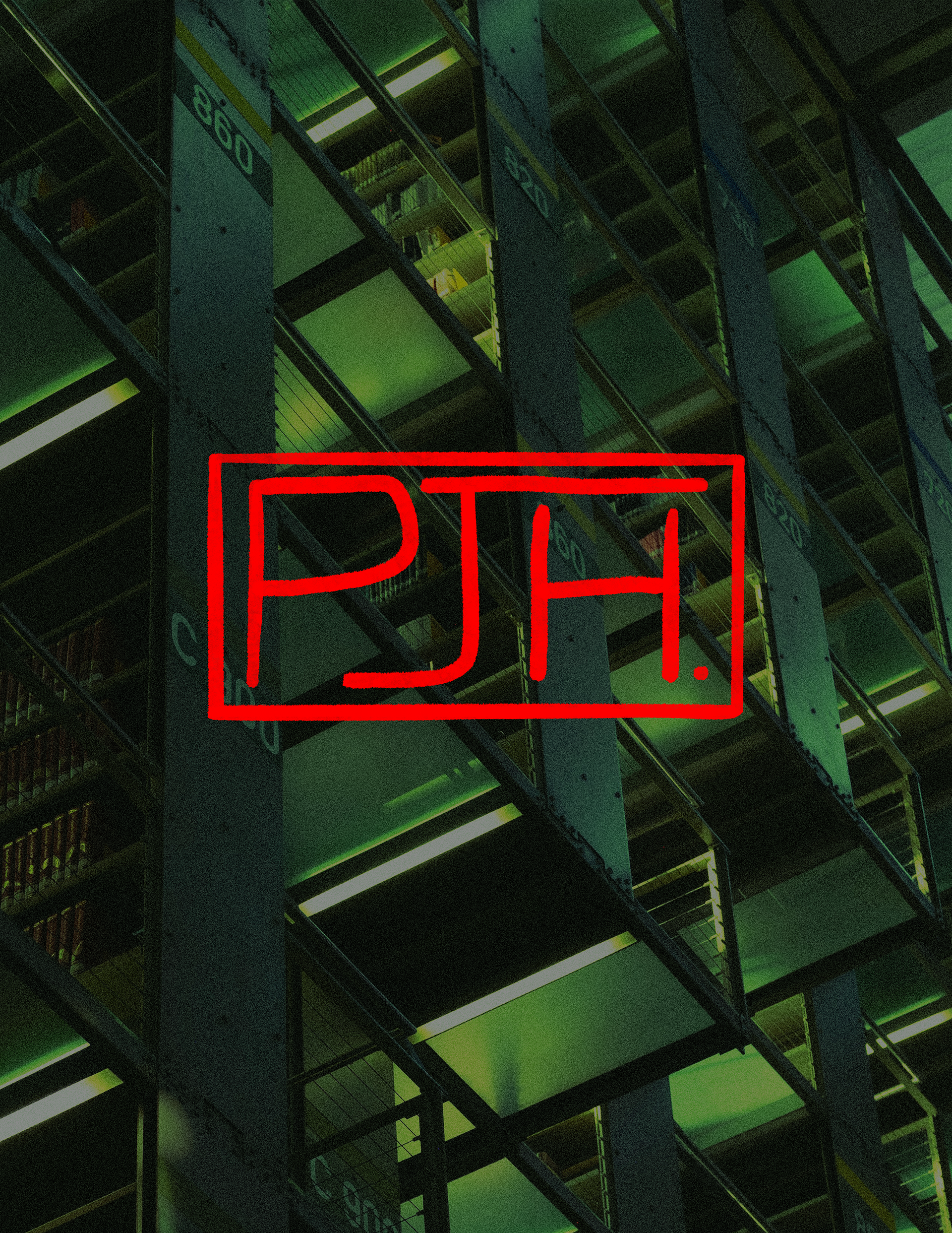
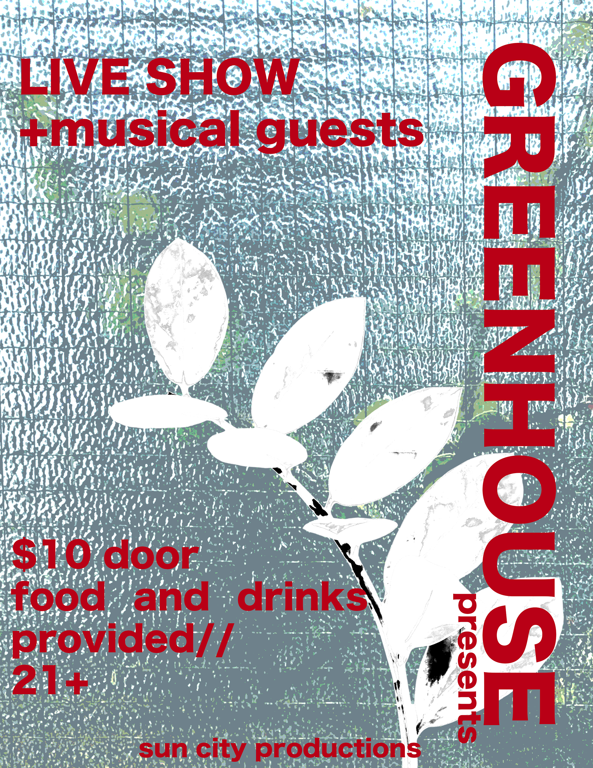
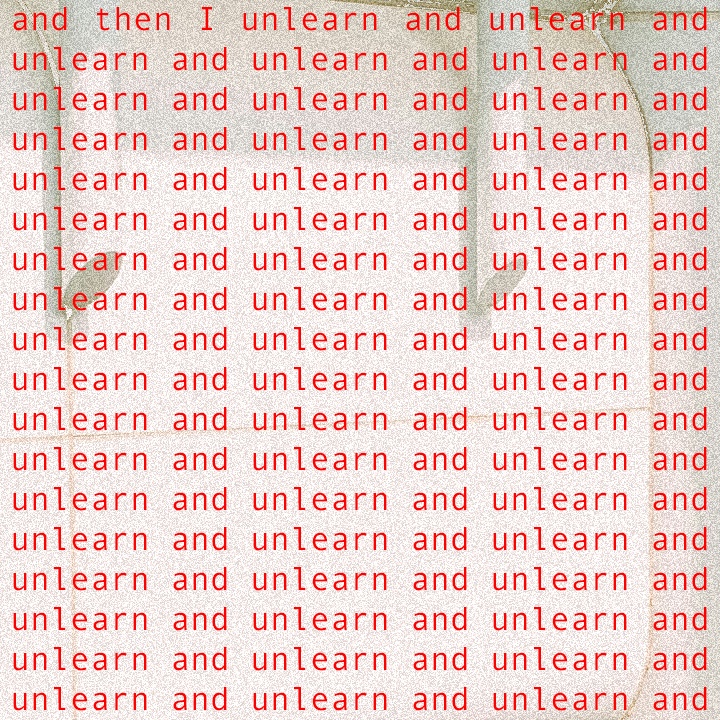
Above is an design practice series I did that experimented with type and

A logo for a colleague's hip hop music project, Two Ton Mantis. He was leaning towards something elegant with a touch of edge to it, specifically geometric styles. I found my references for the mantis head, and broke it down into its simple shapes while still retaining the body and image of the insect.
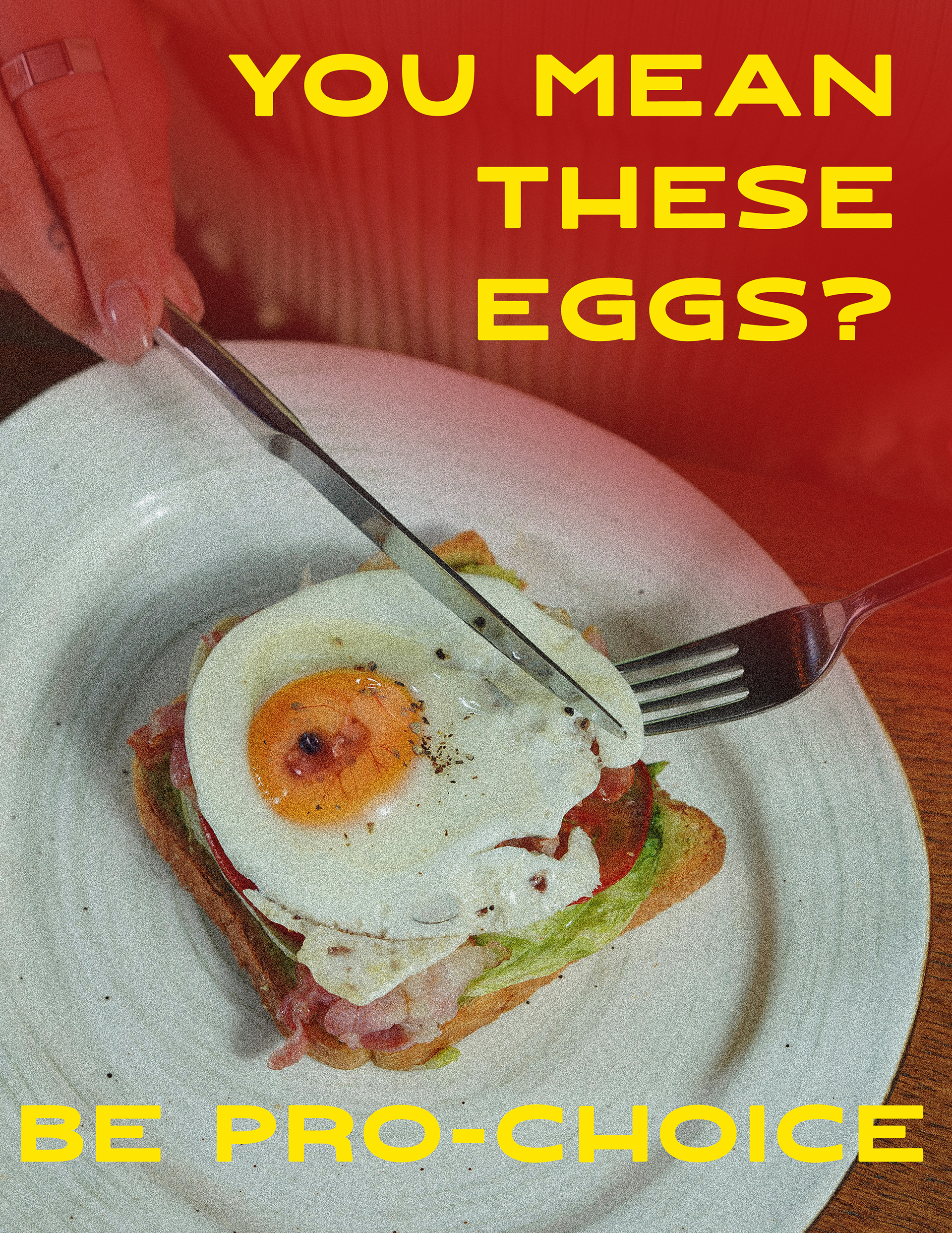
An illustrative poster for a class project, featuring a chicken fetus imbedded into a breakfast sandwich with the title "you mean these eggs? be pro-choice." I wanted to lean into the grainy vintage illustrations of the 20th century, calling back to the nuclear family, while delivering the punchline in a subtle but hard hitting way. it takes the viewer a moment to process the image, taking everything in before they understand the gravity of the message.
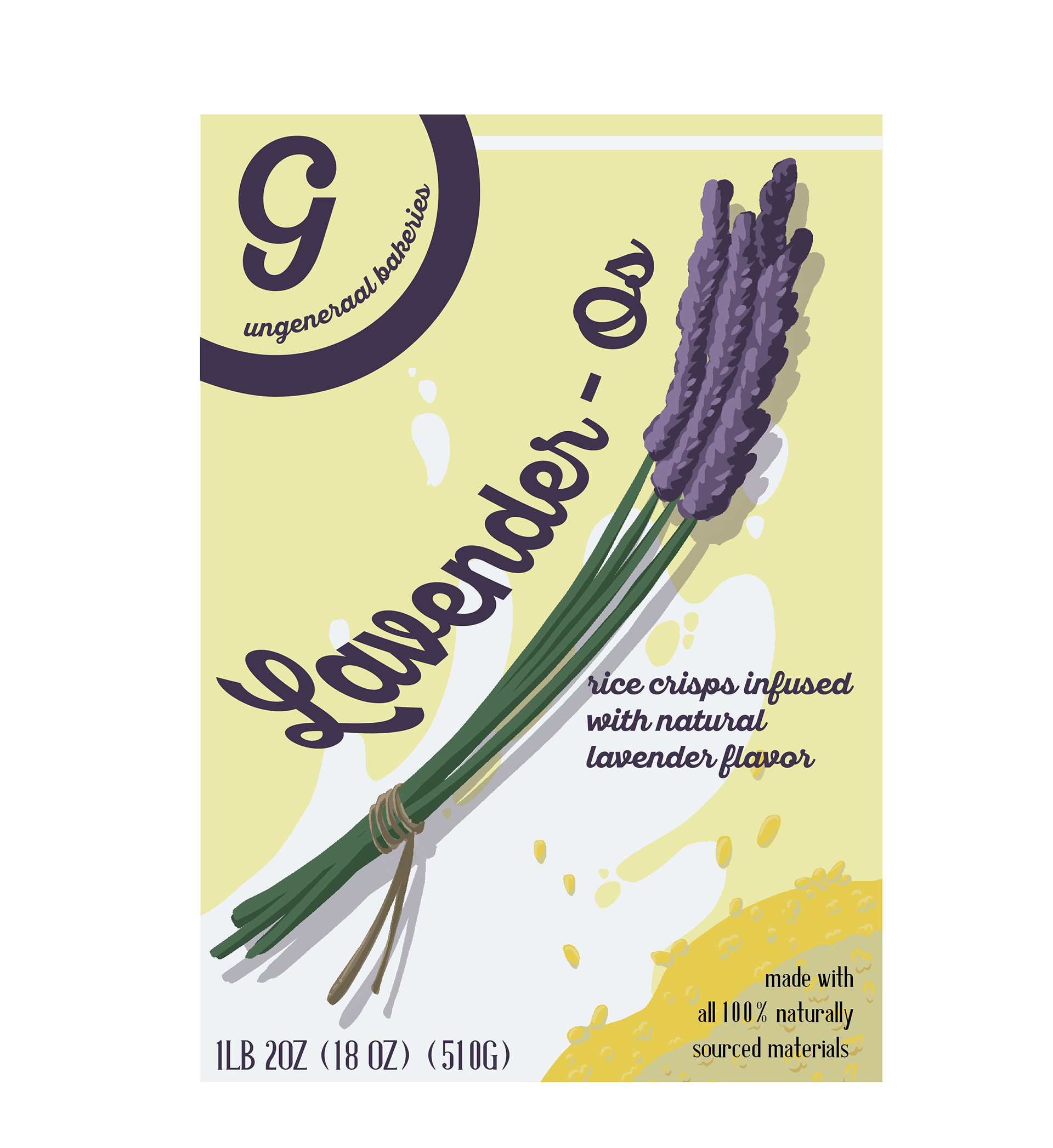
A fictitious mockup of a cereal brand, Lavender-Os. If you're a fan of lavender like me, then you too wish these existed.
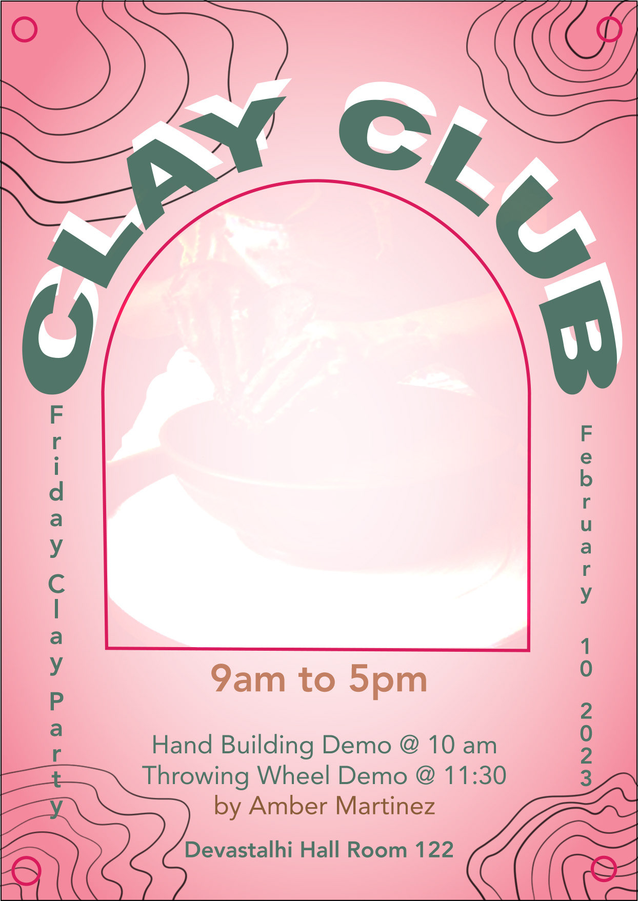
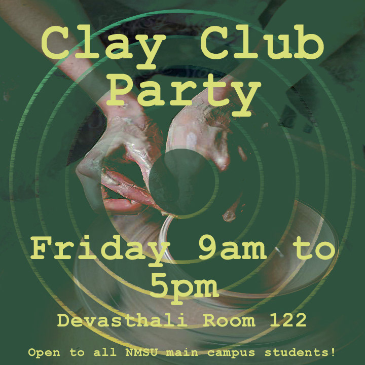
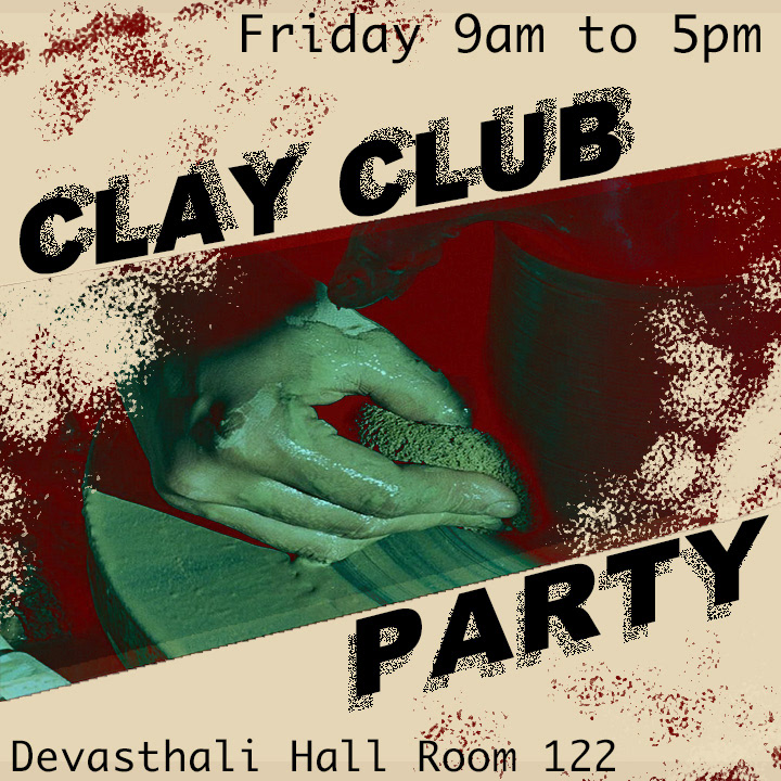
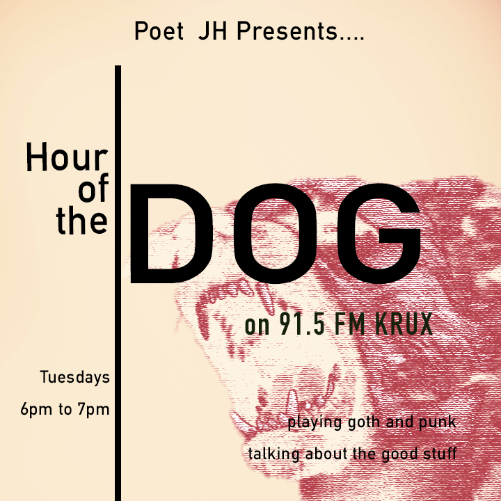
Above are posters I designed for the NMSU Clay Club, and my own radio show featured on KRUX 91.5 fm (pictured far right).
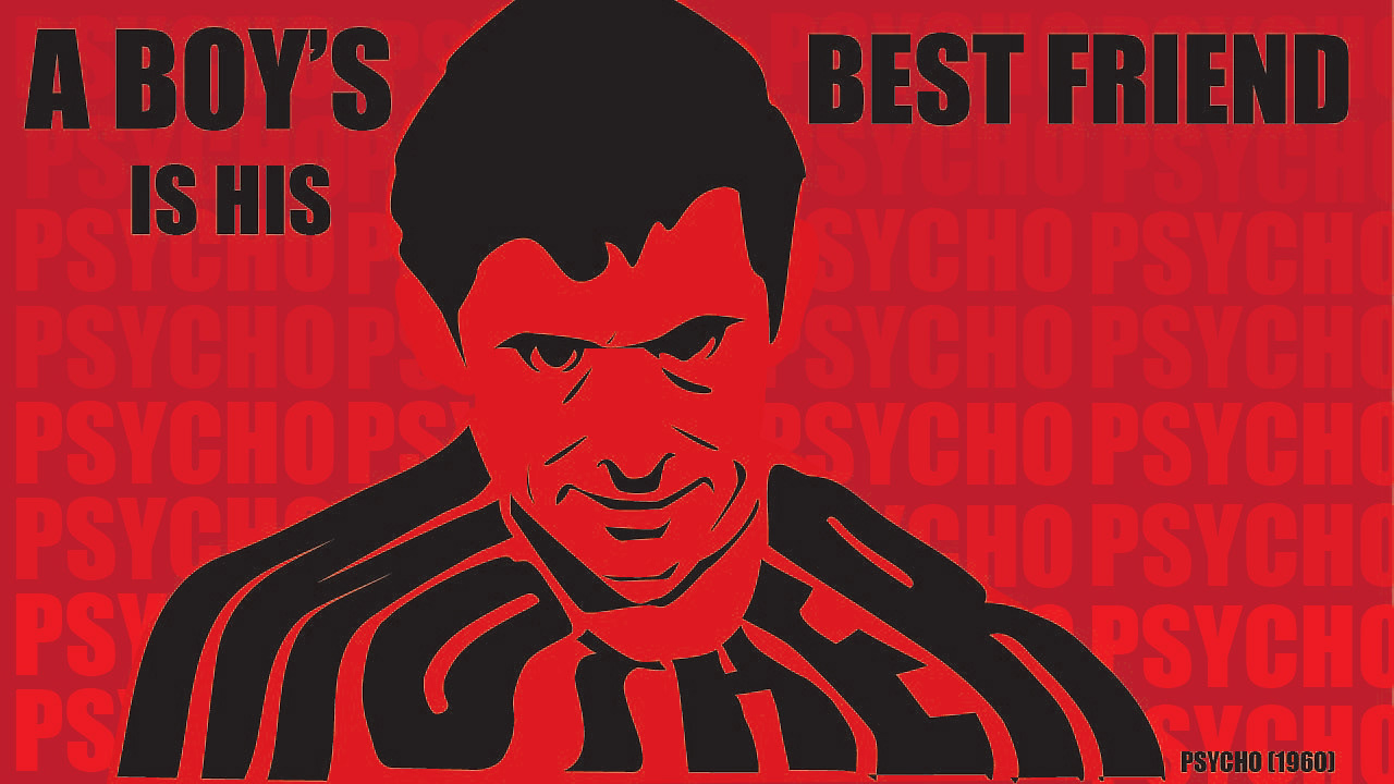
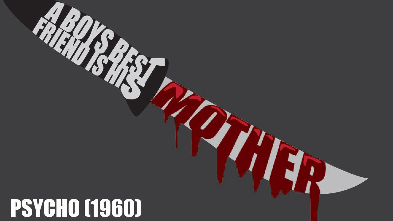
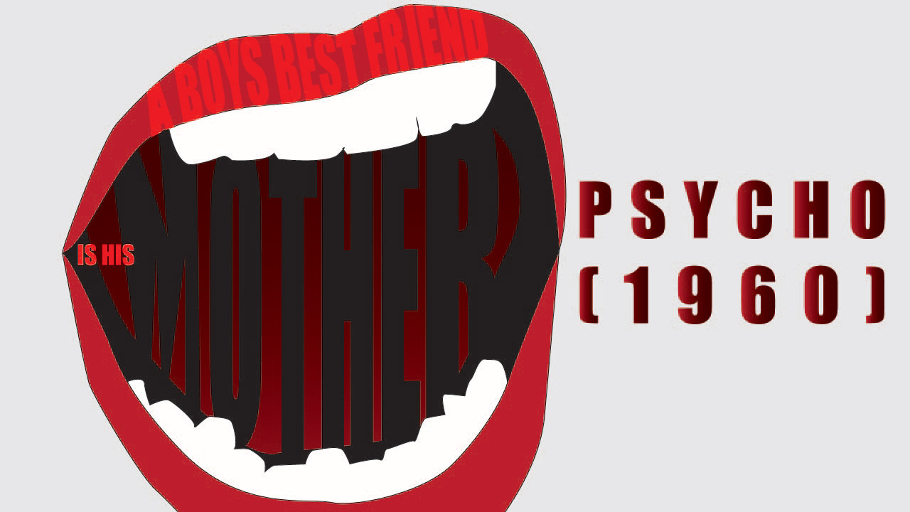
A series of text posters based on Alfred Hitchcock's film "Psycho".
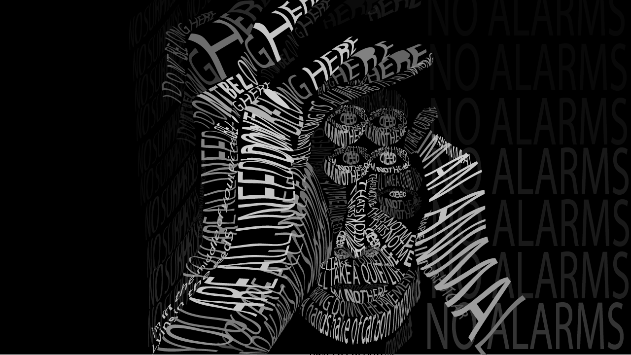
A portrait of Thomas Yorke done entirely in Radiohead lyrics.
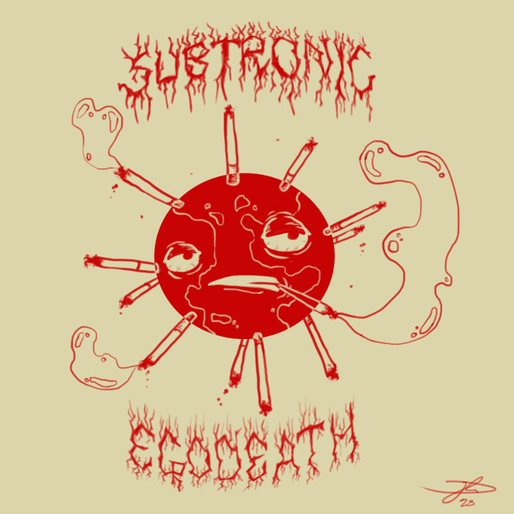
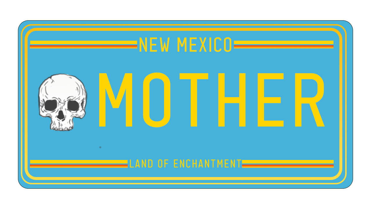
Above are two designs featured in the short film "Forgive Us Mother For We Have Sinned", whose central theme was the issue of climate change. The first design is a fictitious band logo, worn by one of the main characters and featured on initial visuals. The second design is a fictitious license plate that can be seen on the main. character's car.
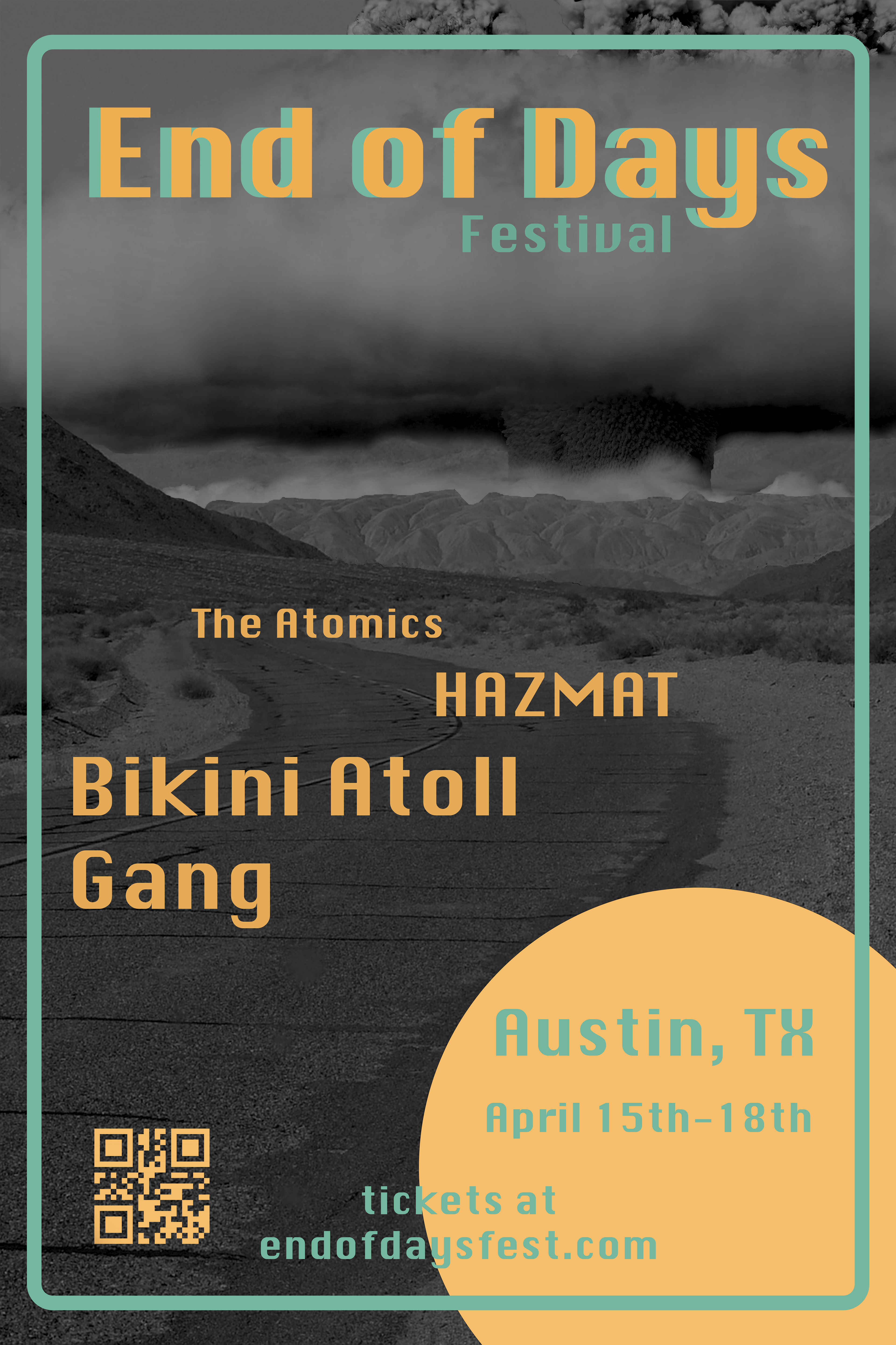
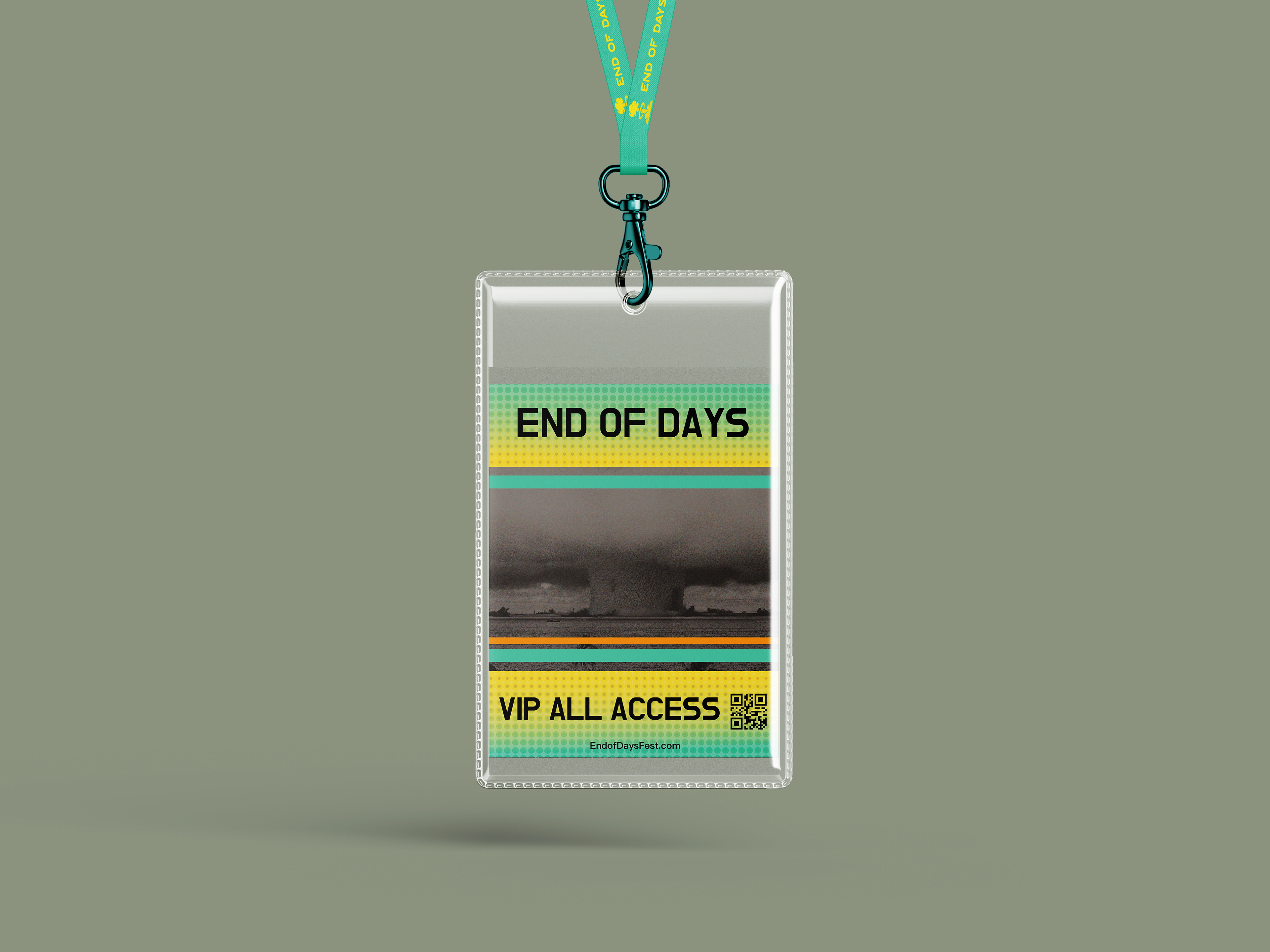
A festival design project based on the nuclear era of the 50s and themes of apocalypse. The colors were chosen both as bright contrasts against a grim theme and as soft pastel references to the palettes of that time period as well.
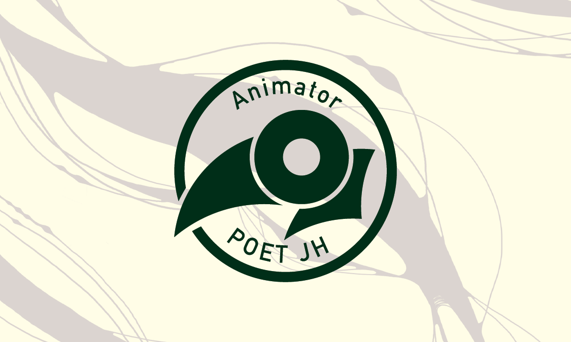
The front and back designs for my business cards, the QR code leading to this website, and featuring my custom logo. The bird has been a leading motif in much of my work.
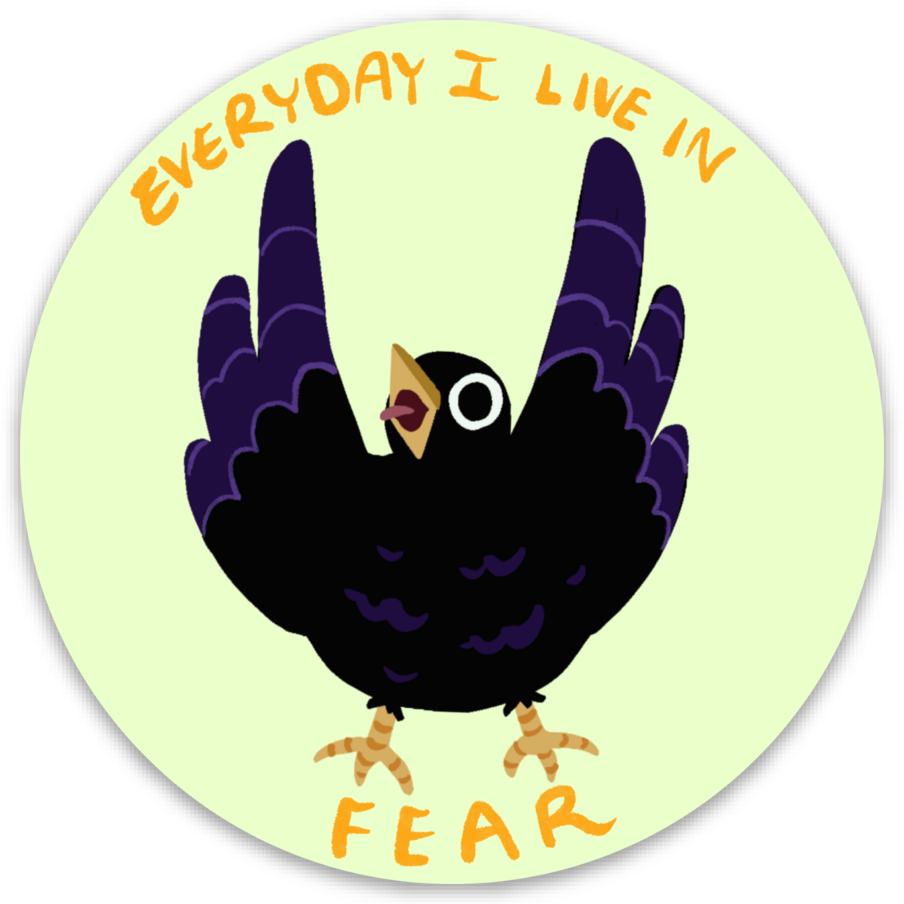
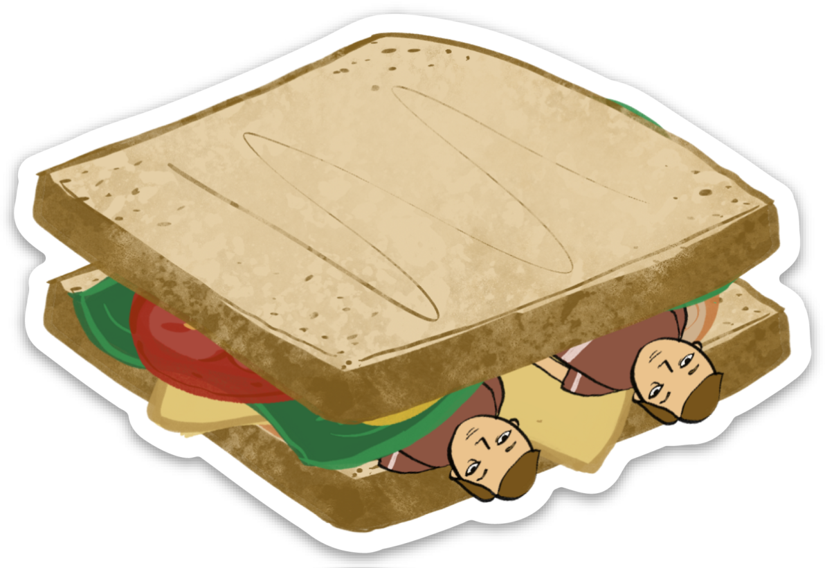
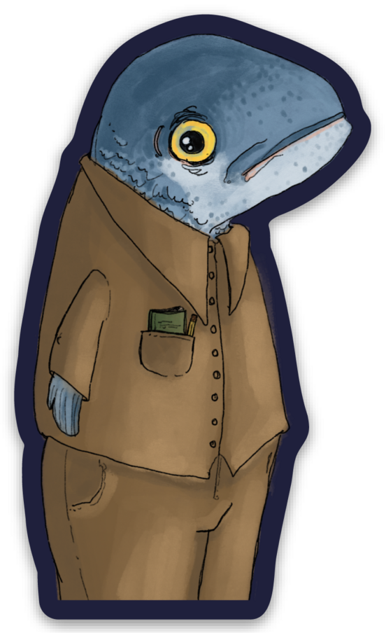
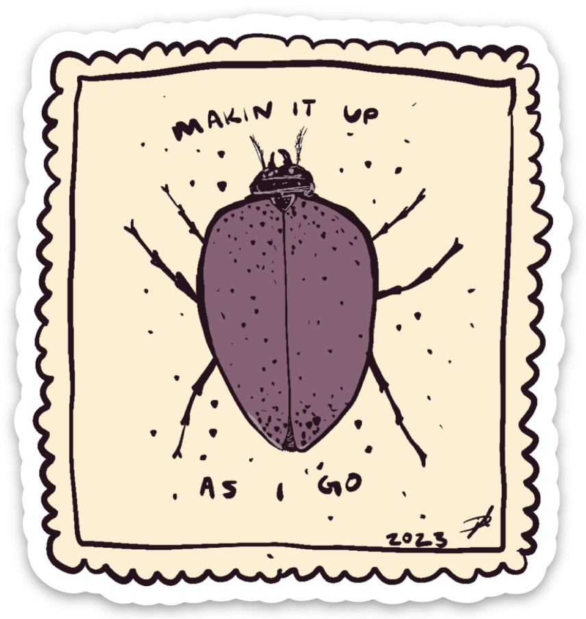
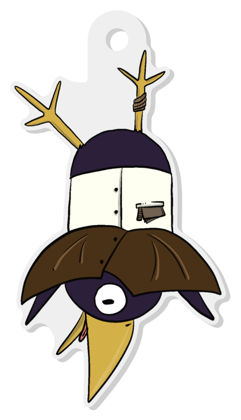
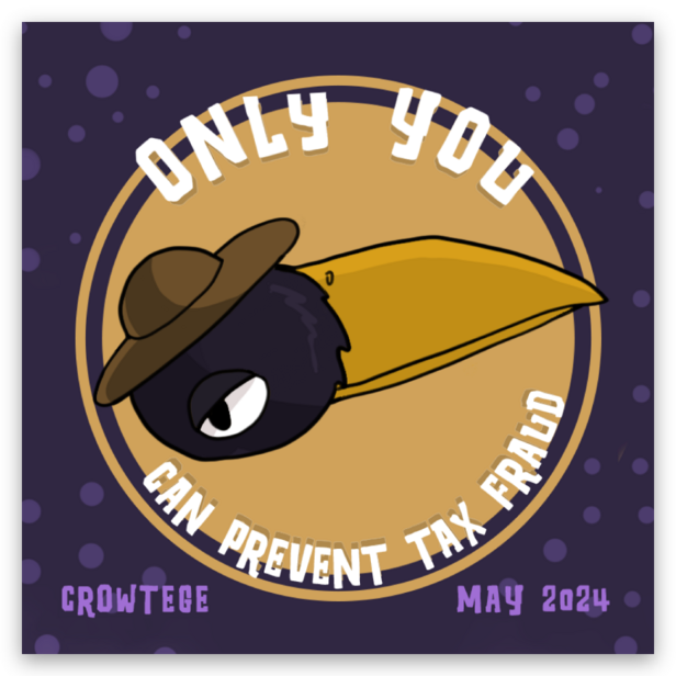
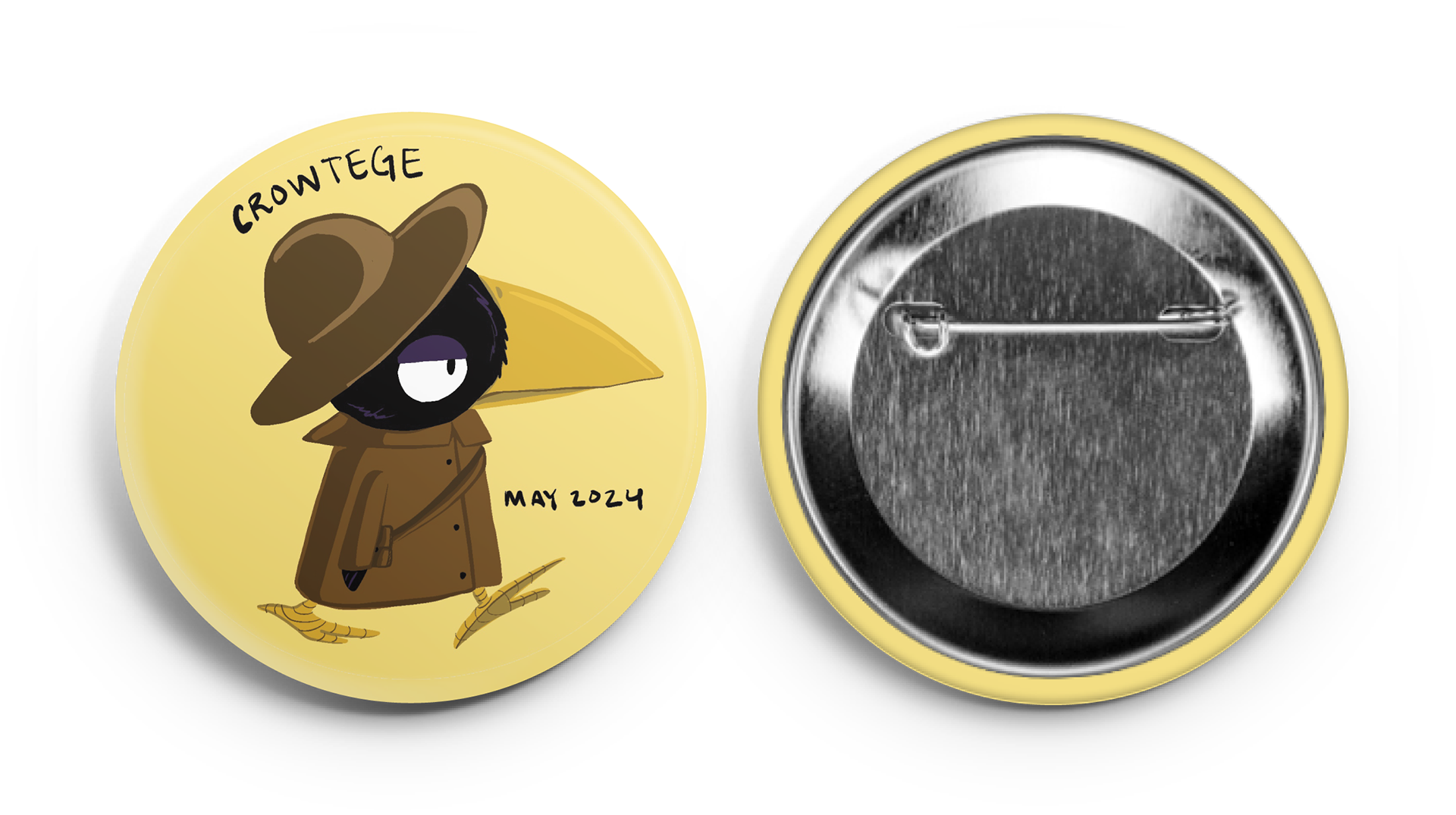
A series of stickers, pins, magnets, and keychains that I made as part of the promotion for my short film and my work as a whole.